Project Brief
Redesign the Pivot Portal Website
Create a styleguide of assets and color themes
Client: RRDonnelley
Role: Lead Designer
Year: 2019
Original Web App
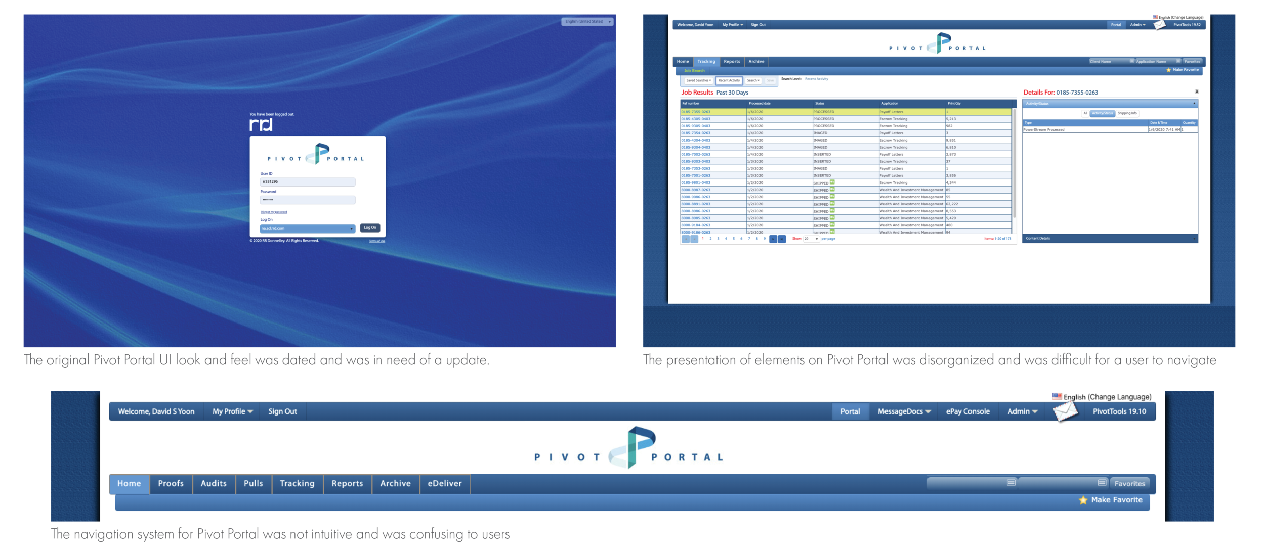
The main issues I found with the original design of Pivot Portal was the dated UI design, the bloated presentation of data elements and the non-intuitive navigation system. These were the issues I focused on for my redesign.
Web App Redesign
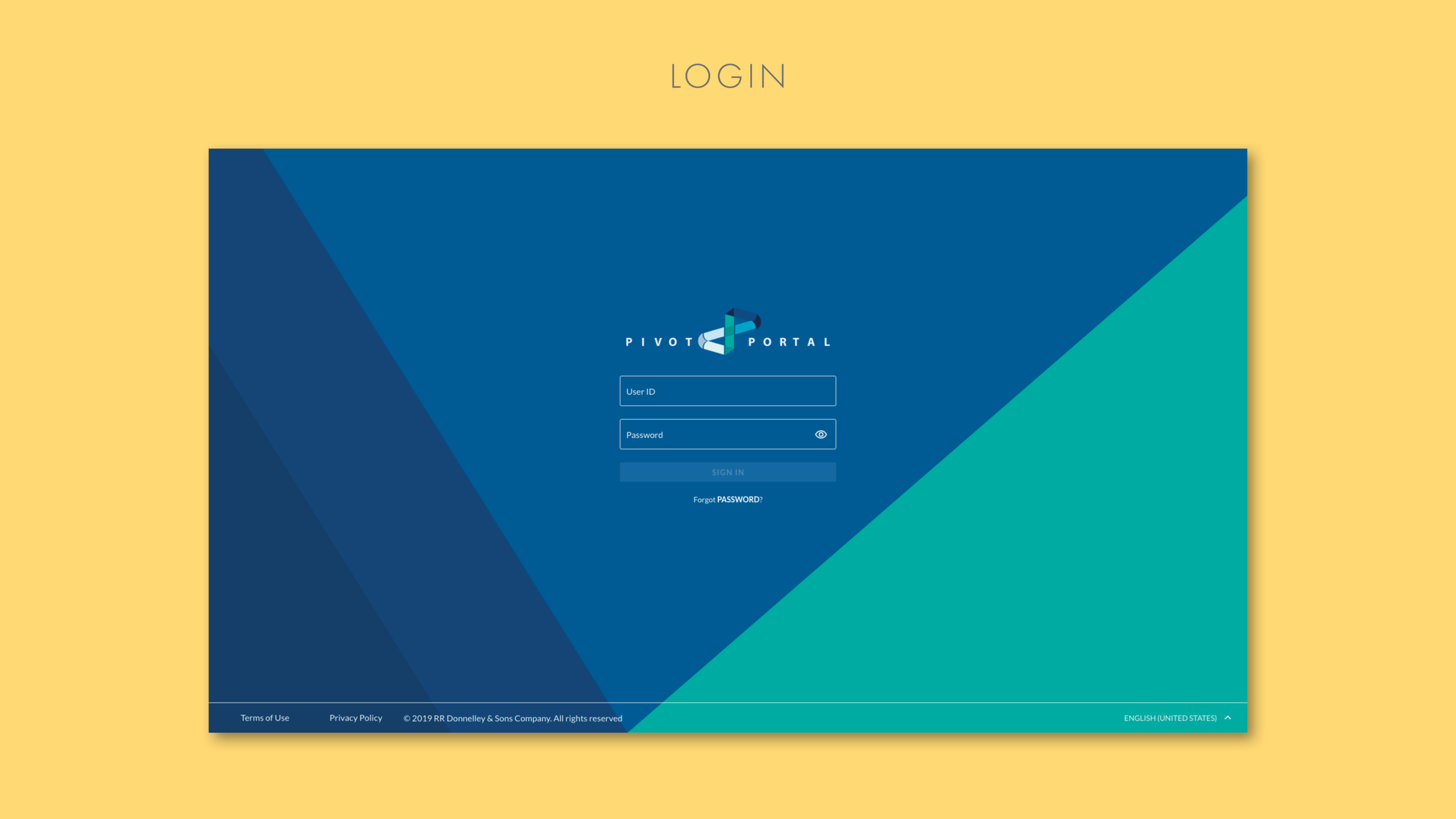
For the visual design of the redesign I pulled in color elements from the Pivot Portal logo and introduced them into different elements within the site. I also update the UI elements using a material design style.
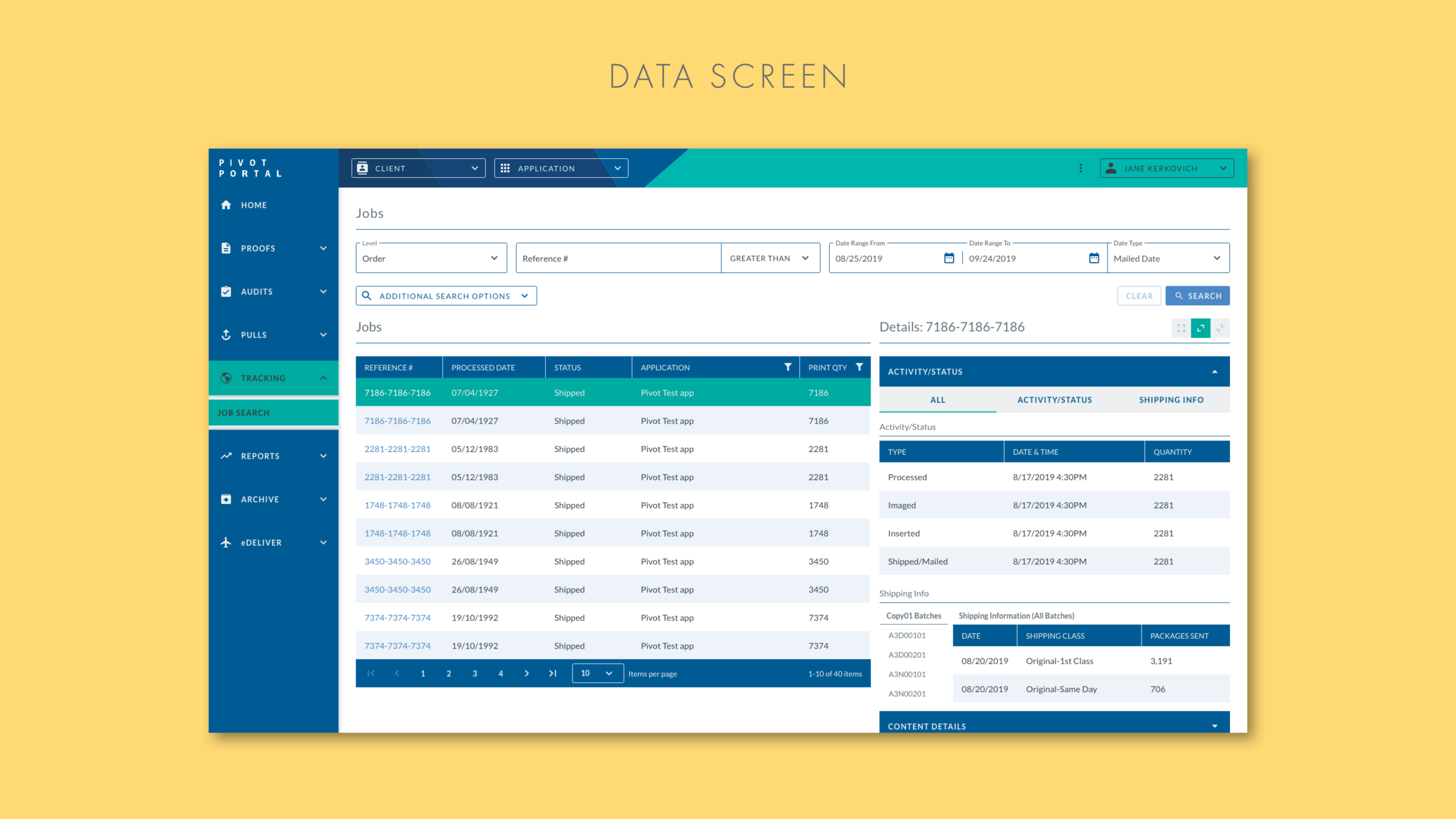
I simplified the navigation elements into 2 parts. On the left is the main navigation section. At the top is the sub nav. For the main page I exposed the search areas so that users would not need to click a search dropdown. For the data element, I enlarged the table and details area giving the data more space and making it easier to read.
For the redesign the client was looking for the opportunity to make the web app responsive. As the size of the screen shifts the elements on the page also shift. Mainly the Main navigation that goes from full sized to a mini nav, to hidden depending on the screen size.


